
Custom lapel pins are a unique canvas for your original artwork and designs, but working a design onto metal isn’t the same as sketching it on paper or Photoshop. Between stroke lines and a small display surface, there are physical criteria for what’s possible when turning artwork into a custom pin. Luckily, our art team at AllAboutPins works with clients every day to optimize their artwork for custom pins. With this post, let’s walk you through the basics of preparing your artwork for custom lapel pins.
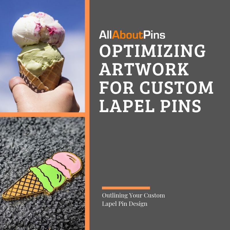
Our lapel pins are die-struck from a custom mold based on the original artwork with enamel paint filling the colored areas after the design is stamped into the metal. In your artwork, it’s important to outline each colored part of a design with separate stroke lines so those areas can be individually painted after the design is stamped. When color is added those stroke lines form borders that keep the color in a single area. Otherwise, the enamel paint would just flow freely into areas of your custom pin design much like the paint bucket tool in Photoshop.

Your partitioned areas shouldn’t be narrower than 0.75 pts or they’ll be too small for the color fill. Meanwhile, linework on a pin design needs to be at least 0.5 pts thick in Photoshop (this should be true in most other art programs.) It’s simply not possible for the pin molds to catch lines or details smaller than that. Starting with your stroke lines at those minimums ensures your vision is faithfully reproduced on the final pin and can save a few days of revisions before going to production.
Color is one of the most important details on any custom pin design so we’ve gathered up the following three most important details to know about working with color in lapel pins.

Color Your Custom Pin Designs in Pantone
AllAboutPins uses Pantone colors to paint our custom pins. And we’re diligent when it comes to finding Pantone colors matching the colors in a client’s artwork. But chances are, you’ll probably know which exact shade or hue of color best matching your original vision before we do. Instead of spending days running color swaps back and forth, picking out the exact Pantone color conversions, you want when you send your design to us will save you time better spent on deciding how you want to customize a design.
Don’t Forget About Your Custom Pin Plating
The raised areas of your pin will reflect the color and look of your custom pin plating. Decide early on which plating you want and factor in how gold, silver or black metal might change the look and atmosphere of your lapel pin design.
Simplify or Remove Gradients or Shading
You can’t add gradients or shaded effects to custom pins due to how enamel paint is poured into the outlined details of a design. If original artwork has shaded details or color gradients, your best bet is to remove the shading and replace the gradient with a solid color instead.
Limit Your Custom Pin Design to Seven Colors
Keep an eye on how many colors are in your pin design to keep production costs low and to save time on production. AllAboutPins offers up to a maximum of seven free colors in any single design and we recommend keeping your color scheme within that limit to minimize costs.
At the popular sizes of 1” to 2”, most custom pins aren’t leaving much space for tons of text or big fonts. So it’s essential to make sure any text on a design is both minimal and legible. For most designs, the text is going to be an accompaniment to the main flair of the design and helps define what kind of atmosphere or character you’re trying to express.

Here are a few easy ways to make the text on your custom pin as legible as possible:
At AllAboutPins our art team works every day with clients to design, proof, and revise artwork for eye-catching custom pins. With over a decade in the industry, the team knows how to adapt and optimize your vision for near any pin design from fully-rendered art to napkin sketches.


